6 ways to display impressive cosmetics to attract beauty followers
The increasing demand for human beauty products means that display cosmetic in stores also needs to be paid more attention. The layout of these products not only requires science but also needs to ensure the aesthetics of the store. The following article of AIT Group will give you 6 ways to display a beautiful interior showroom for a cosmetic store. Let’s refer to offline!
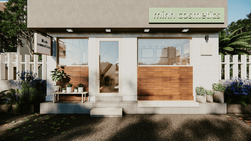
1. Eye-catching store front and sign design
The facade is the face and also the first impression of customers when coming to the store. Therefore, the more eye-catching and unique the design of the showroom facade, the more unique the store sign will make a strong impression on customers. Besides, when constructing a cosmetic showroom, you can use striking colors for the glass door system and signboards to increase the aesthetics and bring modernity to the display space.
2. How to display cosmetic stores to make the customer experience better
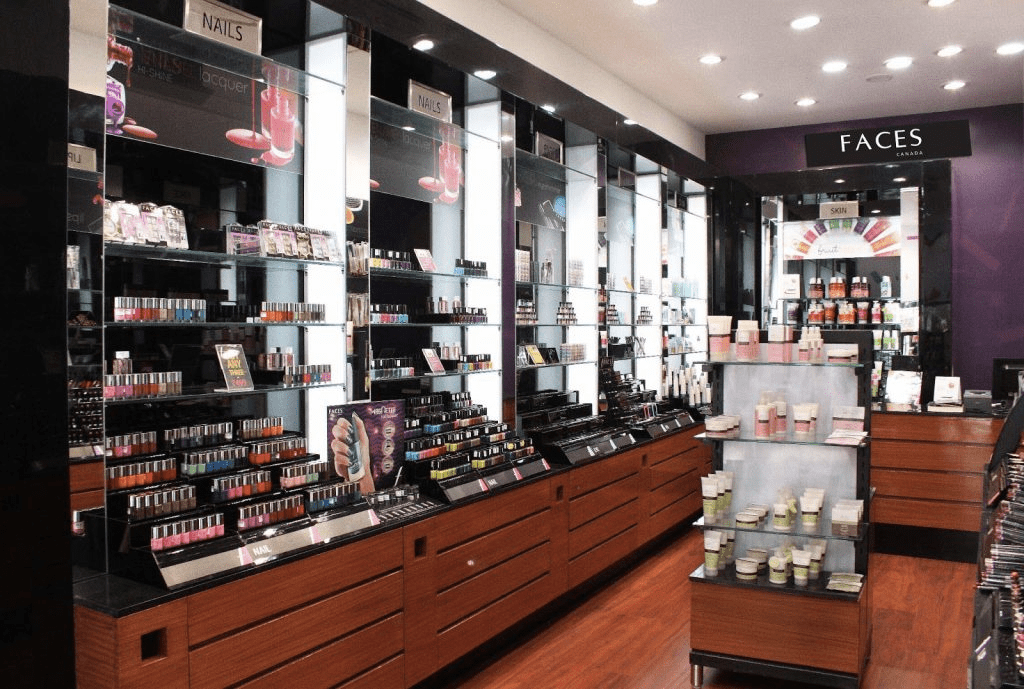
2.1 Cosmetic display in line
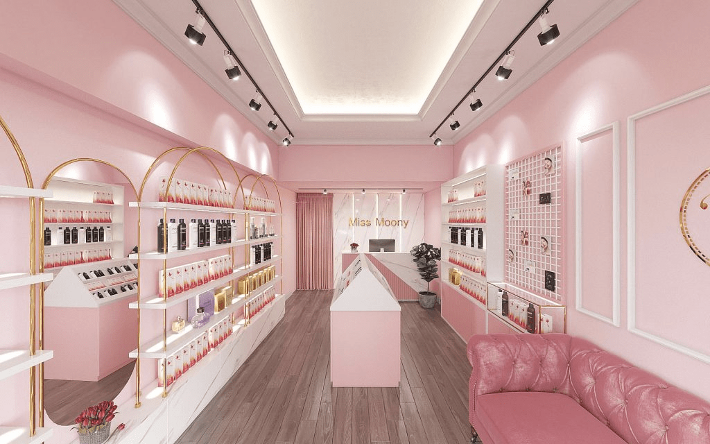
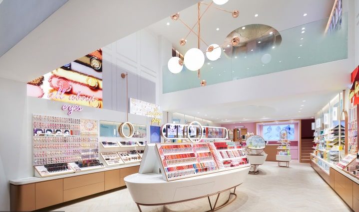
Displaying cosmetics in a straight line is a way that many stores apply today. With this type of display, the shelves will be arranged vertically against the wall to create a parallel aisle in the middle. This arrangement will make the store have a more spacious and airy space. Besides, customers will also easily move as well as observe the products in the store.
2.2 Corner store layout
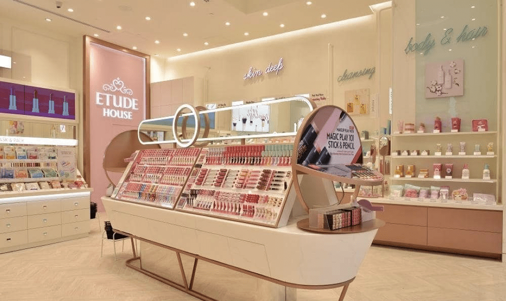
Corner store display is a type of display where each brand or a cosmetic line will be placed at a different angle with its own design. This arrangement takes up a lot of the store’s space, but it will make the products more prominent and attractive. Besides, you can flexibly arrange the lighting system to make it more modern and impressive for customers when shopping at the store.
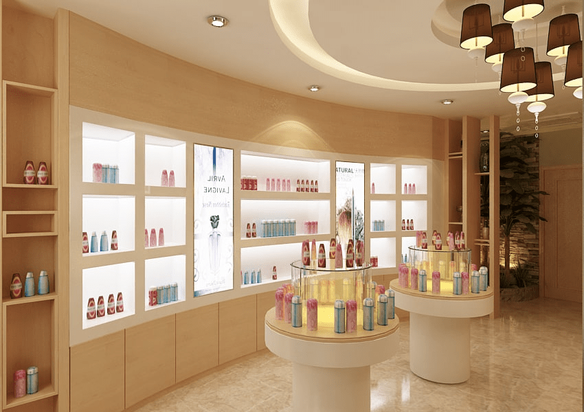
2.3 Arrange cosmetics according to the floor plan
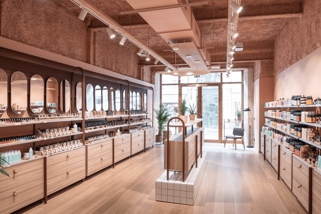
The cosmetic layout according to the floor plan is the type of display that takes up the most space compared to the two layouts above. The shelves in this type of display will be designed with many beautiful curved shapes, creating a modern and new look for the store. However, you need to consider space issues before installing this layout.
3. The secret to displaying cosmetics to increase sales
To design a beautiful, impressive cosmetic store capable of boosting sales, you need to pay attention to details such as: Product display, product placement in the store… Besides, You can also stimulate customers’ shopping needs by placing small value products near the cashier’s shelf.
4. How to choose colors to highlight products and display styles
Color is an important factor when conducting a cosmetic store display. To ensure the best effect when decorating your shop, you can refer to the following notes:
- Create an impressive, new, eye-catching store by using contrasting and complementary color pairs when displaying.
- Use similar color pairs to create a feeling of relaxation and luxury
- Prioritizing the use of colors with natural trends with the main color being green to give customers confidence in the origin and quality of cosmetics.
- For each display area, you should use a different color to highlight the characteristics, uses and brand reputation of each product.
5. Arrange the lighting system to increase the beauty of the store
Lighting is one of the factors that determine the effectiveness of the products displayed in the store. To choose the right lighting, you should be based on the style and main concept of the store. Usually, stores will use white and yellow light to create a warm space and make customers feel more beautiful when using cosmetics in the store.
6. Arranging reasonable functional areas
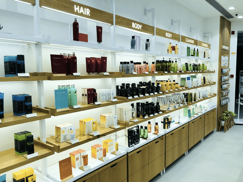
6.1 Cosmetics display area
The cosmetic display area will be the place where customers directly observe and experience the products. Therefore, this place requires a beautiful and scientific arrangement. You can refer to the layout according to the function, use and brand of each cosmetic so that customers can easily choose and search for products. In addition, you can save space by using multi-tiered and narrow shelves.
6.2 Makeup area
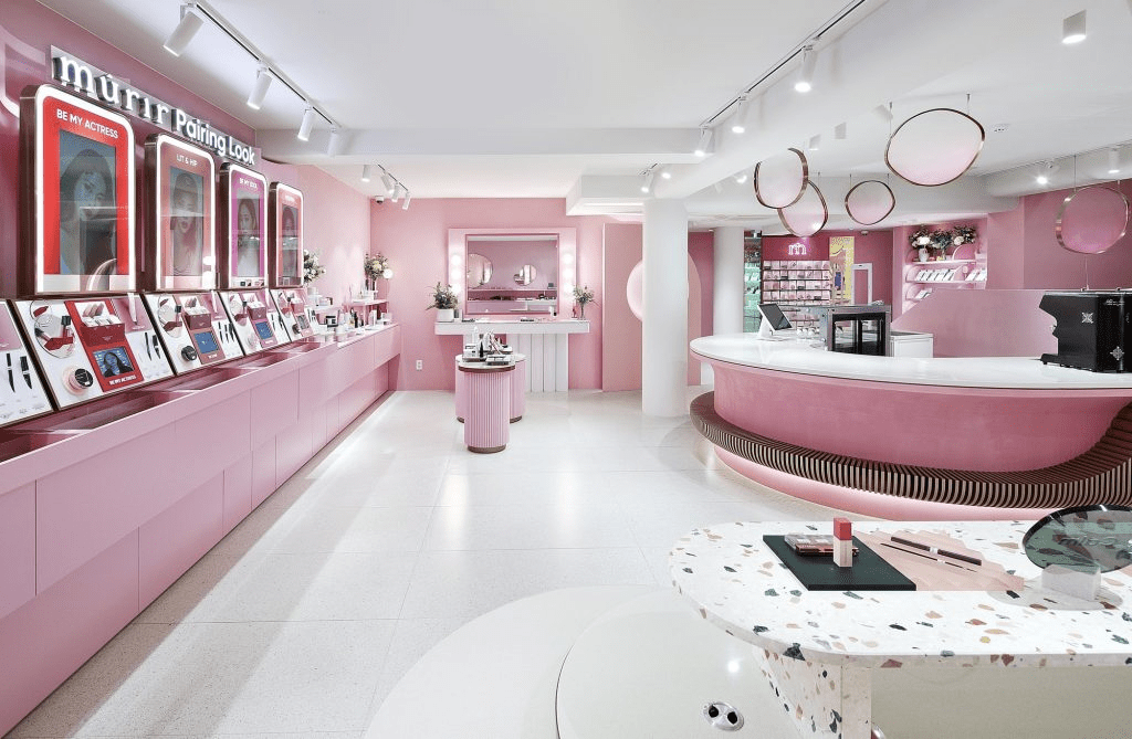
At cosmetic stores, mirrors will often be designed so that customers can easily feel the effect when experiencing the products. Besides, you can also arrange chairs to give customers a sense of convenience and a deep impression of the store.
6.3 Cashier counter area
At the checkout counter, you can order small, pretty makeup products at low prices to stimulate people’s buying needs. In addition, for stores with small space, you should design a simple L-shaped cashier counter to save space and create a spacious and airy stand for customers when waiting for payment.
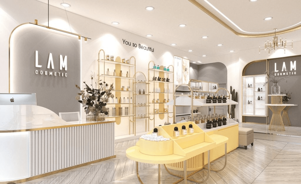
The cashier counter area is small but full of utilities to help customers easily pay (Illustration photo)
Through the above article, AIT Group hopes that you have understood how to display cosmetics beautifully and attract the most customers. Hope the above information has brought you useful knowledge. Thanks and see you in the next article.

