20 world famous car and car company logos and meanings
Are you looking to find out the meaning behind the car company logos in the world? The following article of AIT Group will introduce to you 20 logos of famous car manufacturers and the meanings behind them. Let’s find out together!
1. List of 20 logos of the most famous car manufacturers in the world
1.1 Vinfast
Vinfast is the first automobile brand in Vietnam today. The motto shown on Vinfast’s billboard logo is derived from the phrase “Vietnam – Style – Safety – Creativity – Pioneer”. With this motto, Vinfast has set a goal for itself to become the leading car manufacturer in Southeast Asia and a pioneer in the field of electric motor cars in our country.

Vinfast’s logo
1.2 Porsche
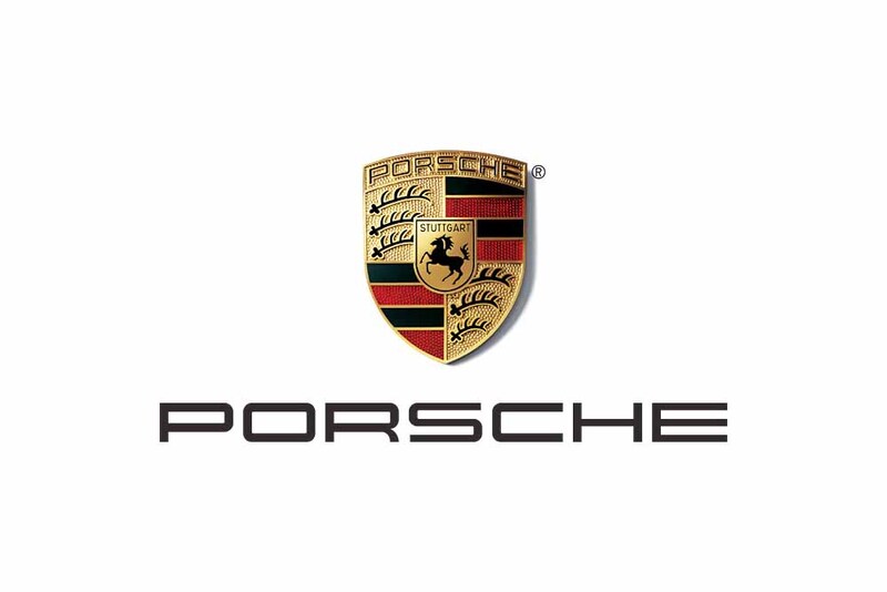
The Porsche logo has been around the world since 1952. The design of this brand is inspired by the coat of arms of the kingdom of Wurttemberg – where there are many horse camps. With the image of a black horse and antlers, the Porsche logo has contributed to honor the history of the car company and give customers confidence in the quality of the product.
1.3 BMW
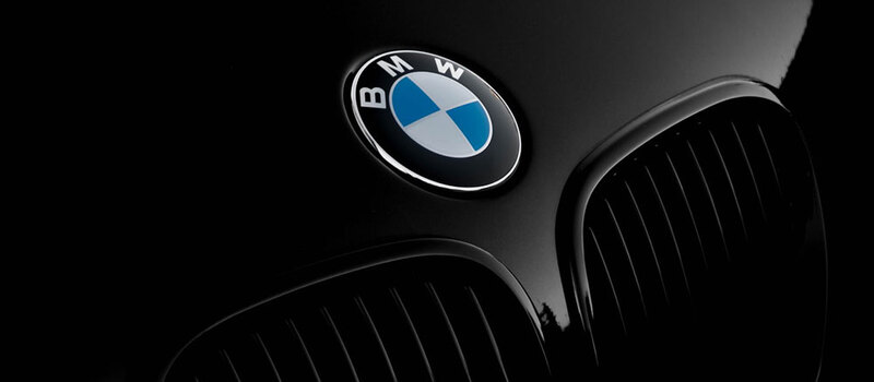
The BMW logo is designed with a black circle and 4 pieces in two colors blue and white. The black color in the BMW brand identity logo is a symbol of power and luxury. Meanwhile, the white and blue colors inspired by the flag of Bavaria – the starting point of BMW show the sophistication and prestige of the product.
1.4 Volvo
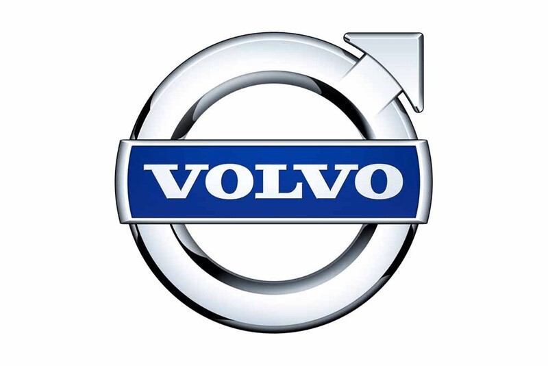
Volvo’s logo is derived from the Roman body, symbolizing Mars and the god of war. In addition, this logo is also understood to represent the iron and metal weapons produced at that time. Therefore, the Volvo logo is a symbol of the strength, durability, and masculinity of this brand.
1.5 Audi
The Audi logo has the main color of silver aluminum. The symbol of four interlocking circles represents the union of four previous Auto Union manufacturers: Audi, Horch, DKW, Wanderer. Therefore, this logo is a symbol of the strength, solidarity, and mightiness of large corporations and the brand reputation of the product.
1.6 Lamborghini
The Lamborghini logo stands out with a shield with a strong yellow bull. The reason this bull is the symbol of Lamborghini is that the founder of this brand – Mr. Ferruccio Lamborghini is very fond of Spanish bullfighting. Besides, Ferruccio is a Taurus (with a bull’s head symbol) so he used this animal to show strength, enthusiasm, and energy for his products.
1.7 Lexus
Few people know that the Lexus logo is inspired by the Toyota logo. However, the special feature of this brand is shown in the stylized letter L and the use of shiny metal effects that are quite eye-catching. Besides, the entire logo is soft and flexible curves that represent Lexus’ ability to glide smoothly when operating.
1.8 Bentley
The letter “B” placed in the center of the logo stands for the Bentley brand name. Besides, the logo is also attached with the image of a wing, symbolizing the flexibility, power of speed, and strength of the products that this brand brings to customers.
1.9 Nissan
Nissan’s logo is designed from the national flag of Japan. Initially, the logo of this brand was designed with the words “Nissan” written on a blue background and placed in a red circle, symbolizing the country of the rising sun. However, later Nissan has renewed the design of its brand with the main color of silver-gray and glossy metal, showing luxury and class.
1.10 Ferrari
Ferrari has an eye-catching logo design with the image of a yellow shield, integrated inside is a mighty dark horse. In addition, the top of the shield is blue and red, representing the flag of Italy – Ferrari’s country of origin. From its logo design, Ferrari wants to give customers the message of endurance, power, speed, and conquer all races in the world of this super-class sports car.
1.11 Mercedes-Benz
The current design of the Mercedes-Benz logo first appeared in 1996. The three consecutive stars of the logo are messages that express the company’s goals and determination to conquer: “Under the sea, on the face of the sea. the earth and the sky”. Besides, the circle surrounding the logo is Mercedes-Benz’s desire to bring customers perfect products with the best service quality.
1.12 Mazda
Mazda’s logo is inspired by the image of a large bird’s wingspan. Besides, the company also uses shiny metal materials, demonstrating Mazda’s flexibility, class, and desire to conquer the pinnacle of global automotive technology in the present and the future.
1.13 Maserati
The three nails on the Maserati emblem were designed based on the Roman god Neptune. In addition, the main colors of the logo are blue and red, which is also a symbol of the city of Bologna – where the two founders of Maserati were born. Maserati’s logo both shows strength and elegance and gives customers confidence in the quality of the product.
1.14 Rolls-Royce
Rolls-Royce is a long-standing British car line founded in 1904. Its logo is rectangular with the lettering part divided into two parts, interlocking. Although this design is minimalist, it still exudes elegance, class and especially shows the strong connection between the two founders of Rolls – Royce, Henry Royce, and Charles Rolls.
1.15 Hyundai
Initially, Hyundai took the symbol like the letter “HD”, however, in order not to mislead Honda, Hyundai changed it to the letter “H”. This symbol not only stands for the brand name but also shows the image of two people bowing and shaking hands, symbolizing the respect between manufacturers and customers when buying their products.
1.16 Honda
The name Honda is the surname of Soichiro Honda, the founder of this brand. Like Hyundai, the Honda brand logo also takes the initial letter H, stylized. These designs have highlighted the logo and made it easy for customers to remember and recognize the brand. Besides, there is also a theory that this arm represents strength and power.
1.17 Ford
The Ford logo was first introduced to the public in 1912. With the main color being blue, this logo shows both sophistication and gives customers confidence in the product. Besides, the white color in the logo also symbolizes the purity, elegance, and nobility of this product line.
1.18. Toyota
The Toyota logo is known to everyone for its three interlocking ovals. In particular, the two ovals above are symbols for the connection and connection of the trusting and sustainable relationship between customers and Toyota. The outer oval represents the world embracing the company’s products. In addition, in Japanese, the Toyota logo also means “Eight”, representing luck and success.
1.19 Suzuki
Suzuki is the 9th largest company in the world in the automobile manufacturing industry. The company’s logo is characterized by a stylized “S”, which is both the initials of the brand and the initials of the founder’s name – Michio Suzuki. Besides, the company’s logo also shows the message that Suzuki wants to send to customers: “Simple, quality and reliability”.
1.20 Jeep
The logo of this brand is also its name – Jeep. With a background color of green, the company has shown a unique, innovative, and somewhat modern design in its design. In addition, the word “Jeep” is represented in Helvetica typeface and the white color also gives the logo charm, elegance, and class.
2. Construction and production unit of professional car company logos in Vietnam
AIT Group is a company specializing in providing the most prestigious logo design and production services in our country today. With more than 25 years of experience in establishment and development, AIT is proud to be a quality logo design and production company that many large enterprises choose to trust and use. Coming to AIT, you can be completely assured of product quality and after-sales service and service mode here.
Besides, AIT also possesses many advantages such as:
- Having its factory for the production of advertising and exhibition equipment
- Using high, modern, and advanced technologies in logo production (especially high-end chrome plating technology)
- The team of architects and workers are highly skilled people who are intensively trained in foreign countries
- Having a lot of experience in construction and logo production for famous brands such as Honda, Toyota, Vespa…
- Warranty after service, quality assurance.
Contact Information:
- Address: 5th Floor – AIT Group Building, 109 Tran Quoc Hoan, Dich Vong, Cau Giay, Hanoi
- Factory: Kim Chung, Hoai Duc, Hanoi
- Website: https://aitvietnam.com/
- Email: aitbuilding@aitvietnam.com
- Hotline: 0983 027 448 – 0913 318 464
With the above article, hope that you have grasped the meaning of car company logos today. Hope the article has brought you interesting experiences and knowledge about the logos of car manufacturers. If you need advice or learn more about the construction and production of car logos, please contact AIT Vietnam via hotline 0983 027 448 – 0913 318 464 or website https://aitvietnam.com/
